the Spare tonic redesign
I partnered with a classmate to redesign the Spare Tonic label for this four-week project. As a team, we brainstormed different changes to the label to develop a brand that would satisfy a wider audience.
How do we improve a label design to foster healthy habits and highlight the company goals?
Utilizing graphic design and user research to satisfy current trends, attracting other genders and age groups. Our new design will be more organic and dynamic to provide an elated feeling. Some of our graphic design changes include the ingredient design, background color, fonts, and information layout. These changes made the design feel less clustered and overall more aesthetically pleasing.
Duration:
4 Weeks
Tools:
Illustrator
Photoshop
Adobe Dimension


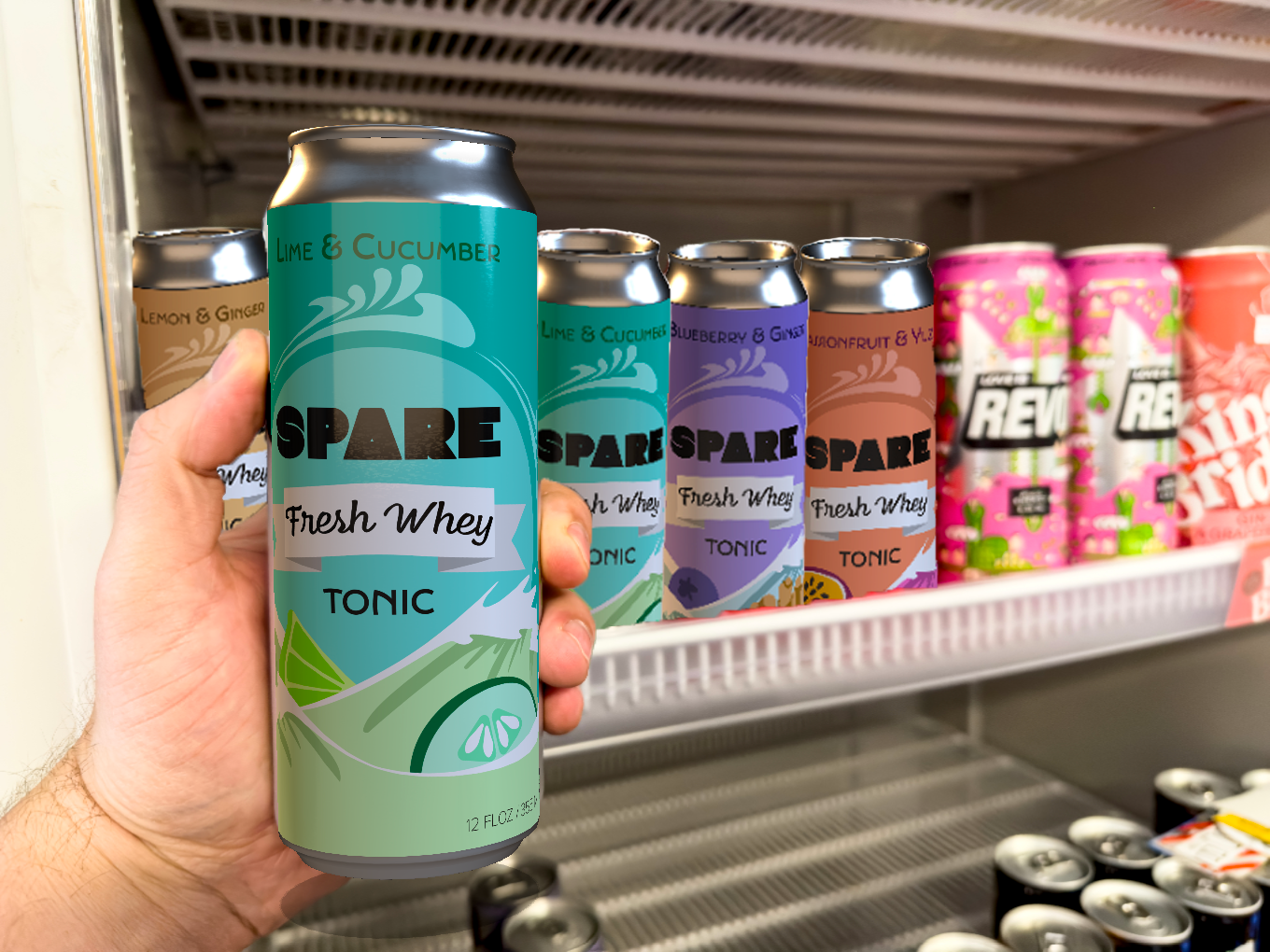
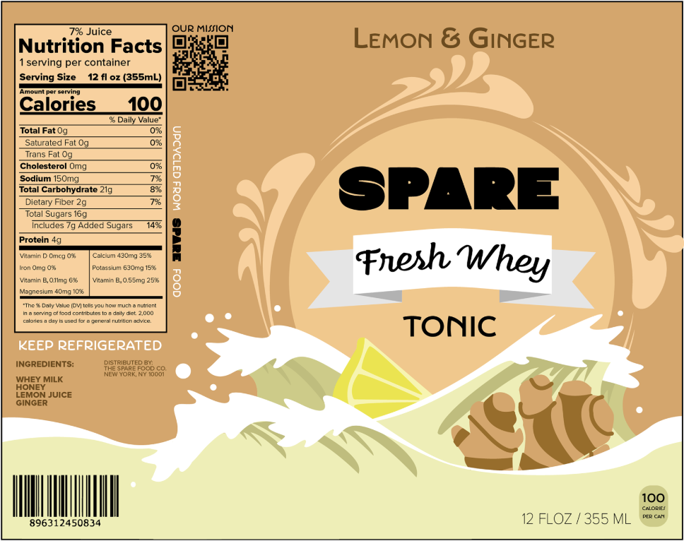
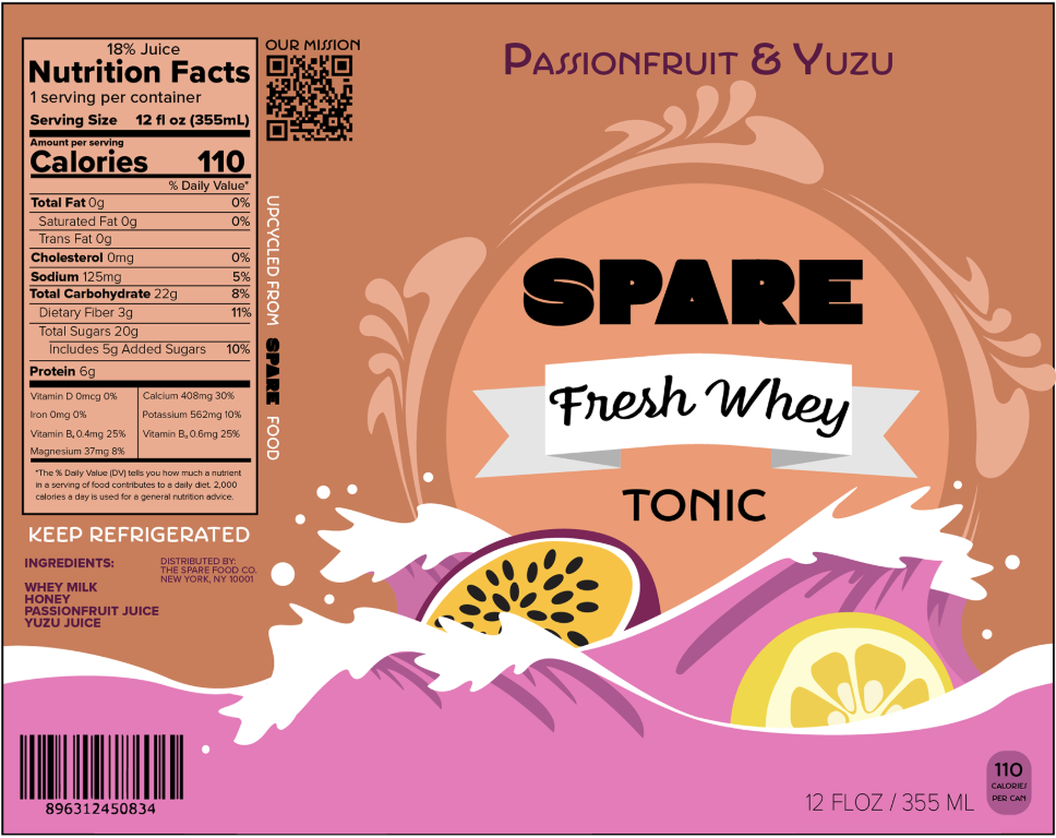
The current Design


Ideation


final design
-
![]()
lime & cucumber
-
![]()
blueberry & ginger
-
![]()
lemon & ginger
-
![]()
passionfruit & yuzu


The current Spare Tonic brand does not have a box design for its drinks. As a result, my partner and I decided to design a variety pack that holds two of each flavor. The variety pack will encourage users to try each flavor and share with others. By sharing with others, more individuals can learn about the significance of upcycled foods.